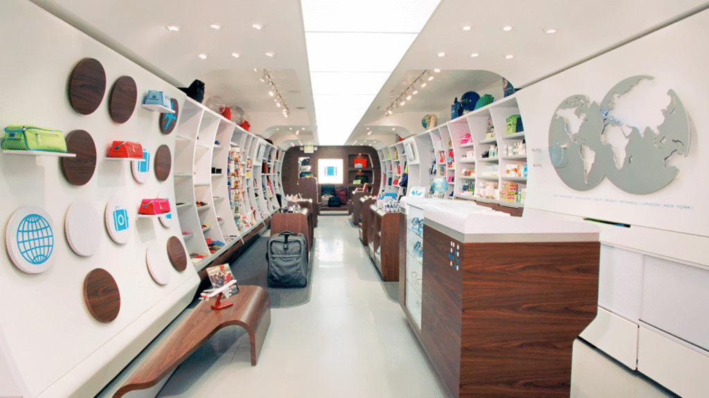
In graphic design, every inch speaks. Space isn’t just what’s left over after the visuals are placed—it’s a language of its own. It whispers or screams. It breathes or suffocates. It invites or intimidates. In the skilled hands of a graphic designer, space becomes an invisible tool of storytelling—balancing chaos with control.
This is the quiet power of space: it tells the story before a single word is read.
What Is “Space” in Design, Really?
To the untrained eye, space might seem like emptiness—what surrounds the logo, floats around the text, or lingers between images. But in design, space is never empty. It's alive with purpose.
Designers think of space in two forms:
- Positive space – the elements we see: text, images, graphics.
- Negative space – the area around and between those elements.
But it’s not “negative” in the sense of bad. On the contrary, negative space is what gives the positive space meaning. It's the silent partner that shapes the story visually.
Control: Order in Design
Control in design is about structure. It’s the sense of intentionality behind every placement, alignment, and proportion.
A well-structured layout:
- Guides the eye where to go first
- Creates visual hierarchy
- Balances content and clarity
- Builds rhythm and cohesion
For example, in editorial design, white space around headlines signals importance. In websites, padding and margins improve readability and flow. In packaging, spacing defines elegance or economy.
Control is about helping the viewer understand the design without ever realizing they’re being guided.
Chaos: When Space Disobeys the Grid
And yet—pure order is often boring. That’s where chaos comes in.
Chaos in design is not about mess. It’s about tension. It’s about unpredictability. It’s what happens when designers bend the rules, break the grid, or let space speak in fragments and noise.
Think of posters with jagged type placements, zines with crowded, text-heavy pages, or social graphics where images seem to fight for room. These are not accidents. They are expressive choices.
Designers sometimes choose chaos to:
- Evoke urgency
- Disrupt expectations
- Reflect emotion
- Recreate natural disorder
Chaos makes the viewer pause. It forces attention. It feels more than it informs.
The Sweet Spot: When Chaos Meets Control
The most powerful designs are not all chaos or all control—they live in the tension between the two.
A chaotic image given space to breathe. A rigid layout broken by one rebellious element. A tightly controlled poster with a burst of asymmetry.
This interplay creates visual drama. It mirrors how life feels—sometimes ordered, sometimes overwhelming. Good design captures that reality.
Imagine a political poster where messy hand-written text fights with white space—that tension reflects the message. Or a minimalist product label with one sudden splash of dense pattern—it tells a story of contrast, of simplicity meeting complexity.
Designers are composers of emotion, using space to strike chords between balance and imbalance.
Cultural and Emotional Space
Space isn’t just visual. It’s cultural and emotional.
In Western design, space often reflects modernism—clean, open, minimal. But in Eastern and South Asian aesthetics, denser layouts with rich, layered visuals and tighter spacing are common—and beautiful.
There’s no single definition of “good” space. It’s about intent and context.
Emotionally, open space might feel calm—or lonely. Dense space might feel exciting—or stressful. That’s why designers carefully calibrate the mood they want their audience to feel.
Every decision—how close the text sits next to an image, how much margin a page allows, how far apart icons are—affects perception.
Case Study Examples: Stories Told Through Space
- Apple’s Product Pages
Controlled. Minimal. Spacious. Every product is given room to feel important. The story is luxury, simplicity, and precision. - Punk Zines of the 80s
Chaotic layouts, overlapping images, tight margins. The story is rebellion, noise, and non-conformity. - The New York Times Magazine
Plays with both. Structured articles with smart use of whitespace, but occasionally broken by full-bleed images and expressive typography. The story is credibility mixed with creativity.
Each uses space as part of the voice, not just the background.
Modern Tools, Timeless Principles
In the age of responsive design, motion graphics, and digital interfaces, the idea of space has expanded. Designers now think in scrollable space, collapsible menus, and animated transitions.
Still, the principles remain:
- Use space to guide, not confuse.
- Use space to feel, not just to fill.
- Use space to say what words can't.
When done well, users won’t even notice the space. But they’ll feel the clarity. They’ll sense the intent. They’ll connect to the story.
Final Thought: The Silence That Speaks
Graphic design is often defined by color, font, and imagery. But space is what holds it all together—and tears it apart, when needed.
It's the pause between notes in a song.
The breath between lines of a poem.
The silence that shapes the meaning of words.
Designers are not just visual creators. They are architects of experience. And space is their most underappreciated but powerful tool.
In the end, whether you're crafting calm or chaos, always remember:
Space doesn’t just hold the design. It is the design.


